Post Mortem
I don't know if anyone will read this but I think it is valuable for myself to reflect on what went well and what did not, plus goals for the future. This is my first time writing a post mortem for a game. I considered it for my previous Lojam entry SMUDGE, however never got around to it. After Smudge, my goal was to make a more complete feeling game.
Prototyping
I think my biggest failure for this jam was in Prototyping. Once I got the basic mechanic down, the game looked something like this:
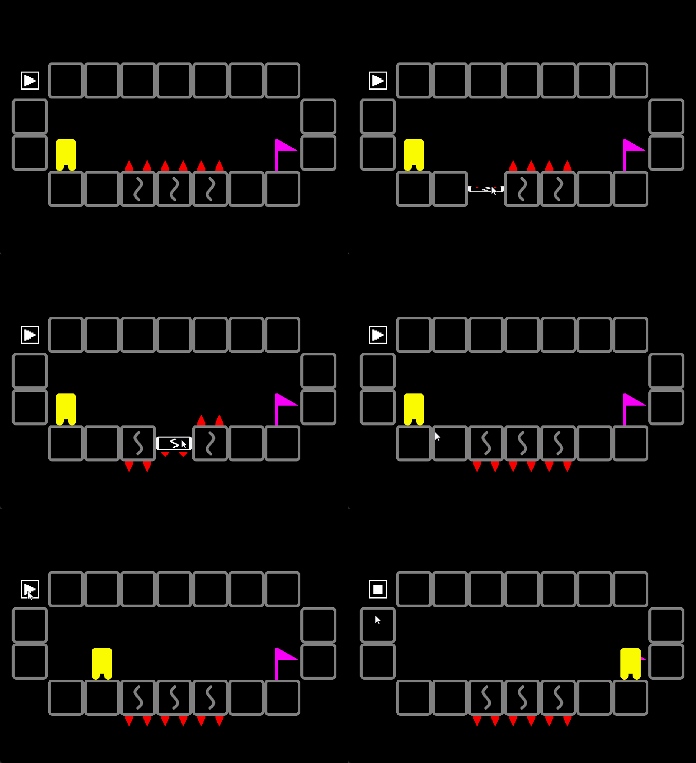
At this point the game had these basic mechanics:
- Flippable Tiles (while in stop mode only)
- Spikes that kill the player
- Flag
- Paly Pickups (not yet fully implemented, but planned)
This was on Sunday, March 24th. It was playable, however I did not playtest until Friday March 29th, the day before showtime.
The game was not too complicated under the hood back on Sunday, March 24th. Not that it is overly complicated now, however around Thursday when I was becoming happy with the the polish and look of the game is when I started thinking about adding more mechanics. My games logic ended up putting a stop to those ideas, since it was coded for the short term, game jam style. The code was not flexible to add new stuff on to it, without breaking stuff.
For example I considered adding a type of tile that can flip while in play mode, however the way the character moves and is drawn, was just not made for that type of change this late into the project. If I could go back I would have liked to playtest early and work on putting in more rough mechanics early on.
Some ideas that may have been added:
- Tiles Flippable in play mode
- Ladders (Most levels currently are designed for the player to move down more often since going up takes way too much space)
- Keys + Doors
- Springs that send the player straight in a given direction until they hit a wall
- Different Sizes of flippable tiles
I don't know if all or any of these would have made the game better, but one of my goals for next jam is to be more flexible in the prototyping phase and playtest early. I have to get over my aversion to playtesting before a game is pretty.
Touch / Mouse Menus
Lately I have been working on a Project Template in GameMaker LTS. I have grown to strongly despise recreating my menu system over and over, which was the main reason for creating the template. It is a work in progress, and this Jam uncovered some kinks in armor for sure.
For example I do not normally make mouse based games, So I had to rework the menu system to work for mouse and touch! One thing I had never considered before was that designing a menu for mouse and touch is not the same thing. Without much thought, I had assumed they were one and the same.
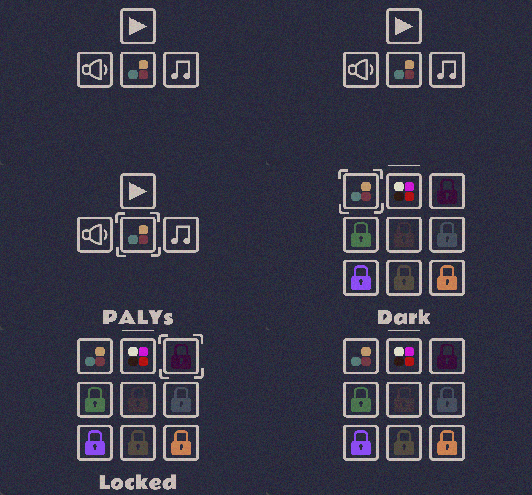
The biggest example of the disparity, and an issue with my menu system is my Icons. While the icons I use are fairly readable (I hope) my menu options have text that they display when the mouse hovers over them. On mobile there is no hover over ability, which I think can make my menu system less user friendly on that platform.
For this game I don't think it is too big an issue, I do wonder if first time players on mobile will recognize the PALY icon and know what it is (although players understanding what PALYs are and how they work is another issue on its own). It did limit me to adding more settings to the game. For example I considered settings for removing the noise, and other effects, but did not want to risk players getting lost in confusing menus, so I left it to the essentials.
I really like my square-icon-based menus but I am wondering if I should reconsider in the future, or how to make it more touch accessible.
I LOVE SIN
Lately I have been really in love with using sin for motions in my games. It is great for stuff like collectables floating up and down, wobbles, or anything that oscillates back and forth. Where I used to write something like this:
if (y_spd == 1){
    y+=y_spd;
    if (y == y_max){
        y_spd = -1;
    }
}else if (y_spd = -1){
    y-=y_spd;
    if (y == y_min){
    y_spd = 1;
    }
}
In this project I used the below sin code to calculate the players rotation as a function of their x position:
walk_sway = 20;
walk_angle = walk_sway * sin( (2 * pi) * (draw_x/TILELENGTH) );
It us a much nicer motion with some ease in and out. In line with my goals of creating stuff that can be reused, I have finally wrote a function to make this a bit quicker.:
function sin_ext(_value, _period = (2*pi), _amplitude = 1){
    // _value and _period should be same unit
    //_position is a percentage of the way through the sin wave
    var _position = _value/_period;
    // _angle is the angle we will input into the sin function
    var _angle = (2 * pi) * _position;
    //take the sign of the angle, will be a value between -1 and 1
    var _sin = sin(_angle);
    // apply the amplitude
    var _product = _amplitude * _sin;
    return _product;
}
So now my player rotation code above becomes this:
walk_angle = sin_ext(draw_x, TILELENGTH, walk_sway);
A bit easier to read, and I can avoid having to refresh my trigonometry skills next time I make a game.
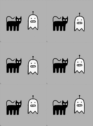
Sin is also good for ghosts (Meet GhostBot and Poopy, stars of a game idea I have had for a long long time, will it ever get made?):
Level Design
When making levels I try and be deliberate with decisions on how and when ideas are presented. This game had an interesting level design challenge:
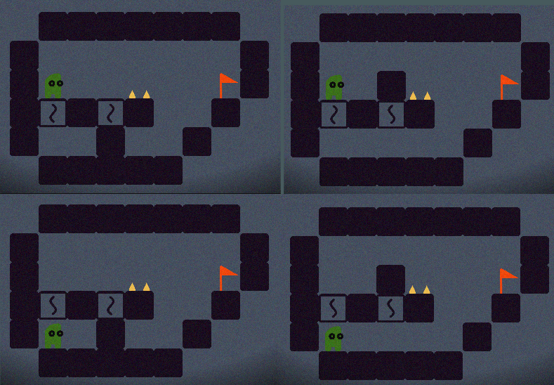
The player can only interact with flip tiles, and each tile only has 2 states. Assuming the tiles aren't interacting with each other directly or indirectly, the number of possible states of the level is 2^n (i think), where n represents the number the flip tiles.
For example, level 2 there are only 2 flip tiles that do not interact with each other and so there are only 4 possible level states:
While designing early game levels I wasn't sure how many levels with this simplicity I should include. Plus when designing a level with 2 flip tiles should they both start in the wrong position, making the solution just click each tile once? Should I add more flip tiles that are purely misdirection, or will that just cloud the player's grasp of the level? I think as I tend to do, I made the difficulty curve go up too fast. I was worried that if i included too many levels of this simplicity, players may get bored before the really fun ideas (flip tiles flipping each other) come into play.
I am fairly confident that this was a misguided conclusion, and I should have included more simple levels near the start, and maybe repeated ideas more frequently so that they would stay in the players head. An example is here:
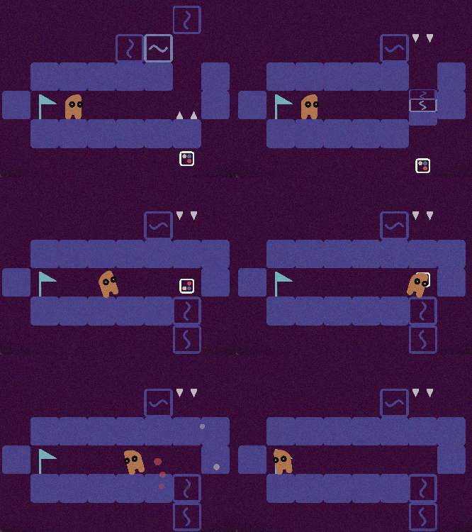
Here I introduce the idea that you can move two adjacent flip tiles across the level. While designing, my philosophy was "Now this idea is used and I do not want to reuse it, the player now knows it." But that is my designer blindness, I can't see this idea with fresh eyes, and after watching people play the game, plus just reflecting on how learning works, I believe that lessons/ideas should be repeated at least 2 or 3 times.
I ideally I would have 2 or 3 levels teaching this mechanic with the final level testing mastery of it. Unfortunately due to the limited amount of possible inputs it can be hard to design levels in this game that require understanding, as most levels can be brute forced.
I think I will test this conclusion in my next puzzle game and try to repeat ideas more to better cement players understanding of them, so that they can use the ideas as tools in the more challenging puzzles.
Final Thoughts
I am happy with how this game turned out, in my eyes I have achieved my goal of making a complete feeling game. In future games my main goals are:
- Getting better at prototyping and playtesting earlier
- Refining difficulty curve
- Completing of my template systems
- Trying to do a paper look to a game that uses flat colour sprites like this one.
Thanks for reading if you did! Bye
Upend
Every flip counts in these tile-twisting puzzles!
More posts
- Post Jam Update - 1.0.1Mar 31, 2024
Leave a comment
Log in with itch.io to leave a comment.